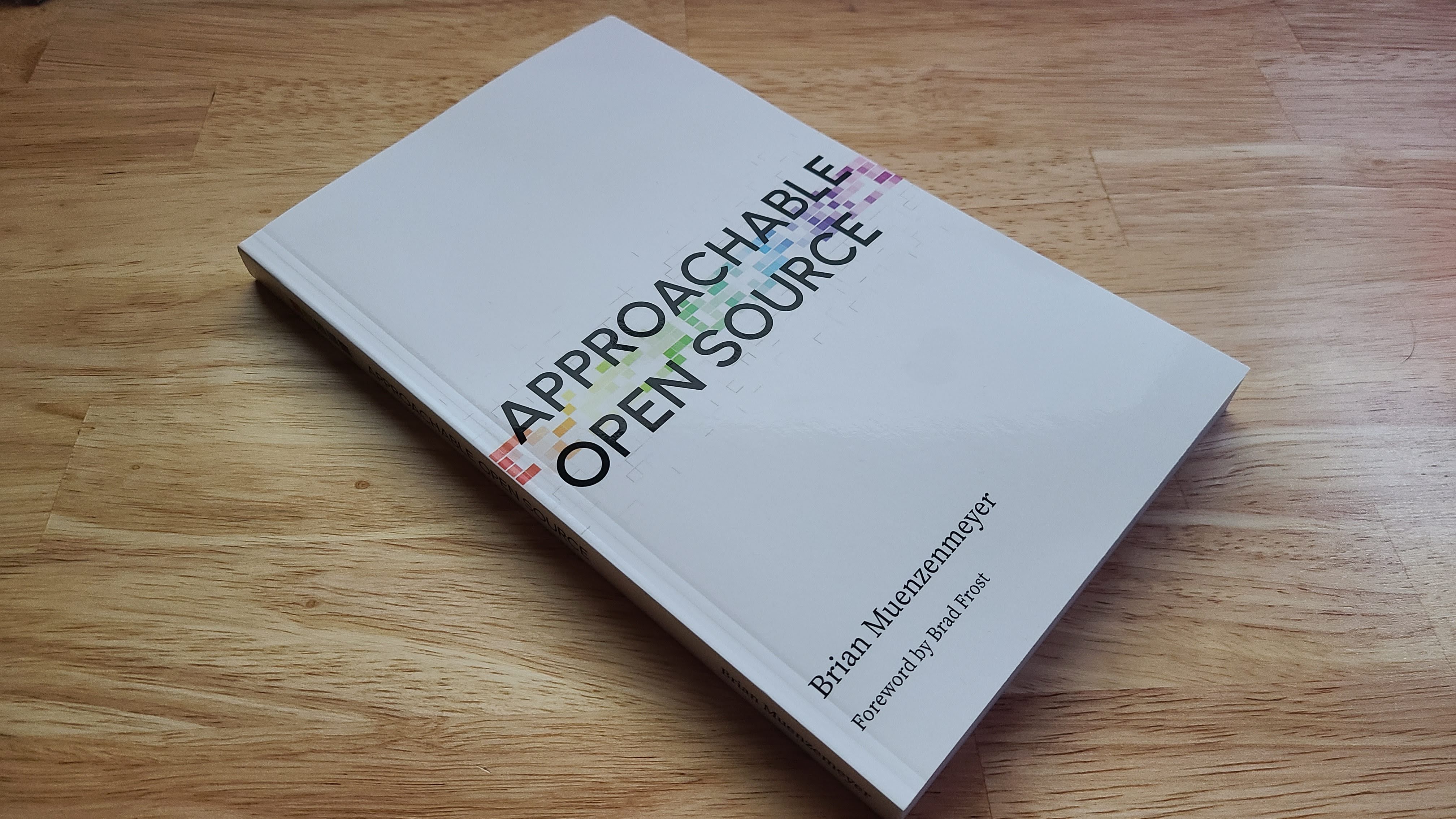
By now I’ve covered the origins of Approachable Open Source as an A Book Apart title. I want to dwell on a moment lost, and how I now realize there was a moment gained in the process.
A Book Apart#
ABA books were designed with a striking cover design. Bold typography mixed with a vibrant color to make for an iconic look. One was great, but a growing collection yielded a rainbow of color, each adding to the spectrum in their own way. Author interviews delved into the why behind a cover choice. The internal project plan even had a distinct task for this. So, naturally as one does finding themself suddenly an ABA author and on deadline, I procrastinated by thinking about what color I’d choose.
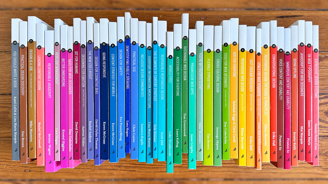
Some contenders were inspired by OSI Green, but I also gravitated to my favorite, gray. You Should Write a Book already had this locked up nicely, though, and I didn’t dare ask for black quite yet.
But, as procrastination sometimes provideth, I realized that the best choice would be one that complements the others. Open source software is not really about you. It’s about everyone else.
The spectrum of engagement opens doors to meet you in the moment, empowering you to contribute to something larger than ever envisioned alone. It was meta, and totally the sorta thing that gives me energy.
I wrote this little script that:
- ingested every ABA title’s color data (now open sourced!)
- aligned it on the visible color spectrum by converting the hex to rgb to hsl.
- found the largest gap between any two titles
- the middle of that gap would be my color
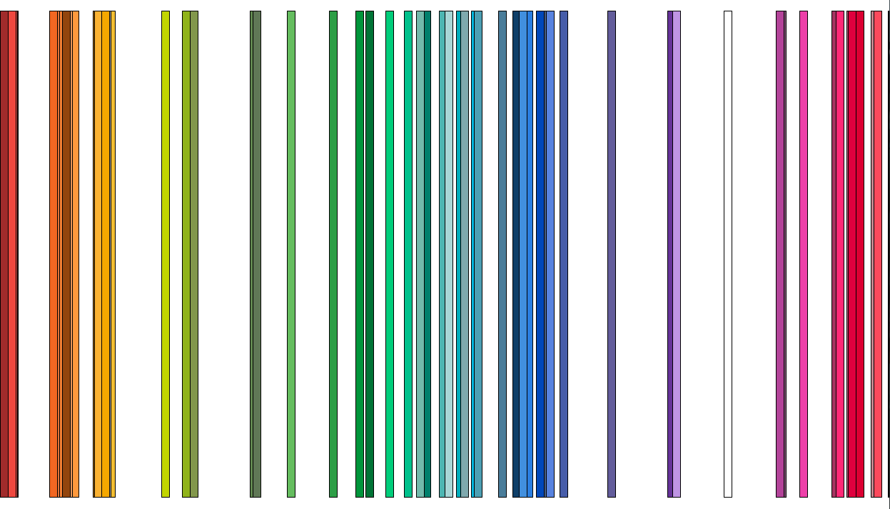
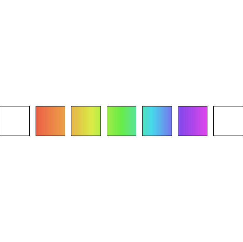
I even animated it with a tiny delay:

The last white bar indicated the color that would best fill in a gap. Voila! I had a color, something in the indigo space.
One could say I had a concept of a plan. I tabled further concerns for now, content that a designer and I could sweat the details later.
As fate would have it, that moment never came and this code and plan remained dormant until now. I might chip away at the generic task of finding the middle of two colors. One new thought would be to use gradients. They seem to be a native solve for this problem.
AI Garbage#
By the time the hiatus soured into complete collapse, I had a few more ideas, and the world did too. AI tools like Dall-E were novel enough to warrant some playtime. I had the concept in my mind for a while of scaffolding. That it took a lot of us together to build what we wanted. There was some blending of the spectrum at this stage too.
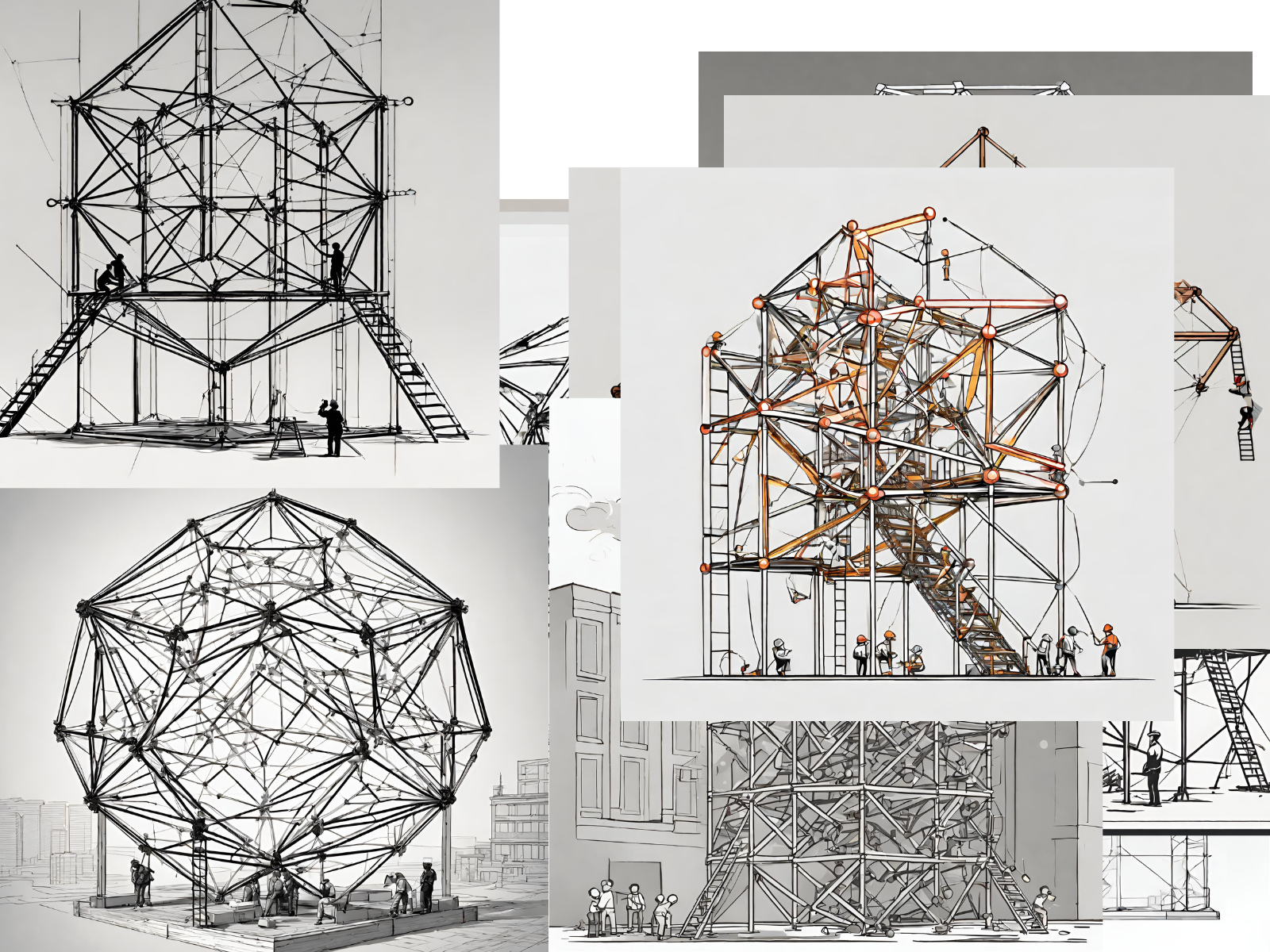

But there wasn’t much intentionality in any of it. AI can only mimic. Besides, I’ve worked to keep every scrap of AI opinions out of this book. So why turn to it for the cover?
<css-doodle/>#
I couldn’t shake the the color spectrum concept out of my mind. Probably because I used it as a direct visual aide in the book within a section called “The Spectrum of Engagement”.

This topic commands a whole chapter in the book, but it perfectly represented what I wanted to convey in the cover. Somehow. I wish I remembers the exact moment, but I eventually resolved to play on the GitHub contributor graph. It’s emblematic of open source contribution, and polarizing as a measure of value. It was the perfect vehicle for layers of meaning. Of intention. Take that large language models.
This was also the perfect opportunity to finally use a tool I had bookmarked for ages. css-doodle is an open source web component that uses CSS grid to draw patterns. Heck yeah!
I suck at drawing, but could I code my cover?
Well, yes, yes I could.
See the Pen AOS Cover - Font Pairing by Brian Muenzenmeyer (@bmuenzenmeyer) on CodePen.
It’s 39 lines of HTML, the css-doodle syntax pretty straight-forward to grok. The CSS is perfectly capable of saying, make this document 8.5 x 5.5 inches, exactly like a book cover.
<main>
	<span id="by">Brian Muenzenmeyer</span>

	<h1>APPROACHABLE OPEN SOURCE</h1>

	<css-doodle seed="1010" use="var(--rule)" grid="52x19"></css-doodle>

	<span id="forward">Foreword by Brad Frost</span>
</main>

<style>
	css-doodle {
		--rule: (@size: 10px;

				@random {
				border-top: 1px solid grey;
			}

			@random {
				border-left: 1px solid grey;
			}

			@match(y < 4 || y > 16) {
				@random {
					border-top: none;
					border-left: none;
				}
			}

			@match(y > 7 && y < 13) {
				background: hsl(calc(@x*6) 80% 60%);
				border-top: none;
				border-left: none;
			}

			opacity: @pick(1, .6, .3, .1, 0, 0, .2, .4, .8);
		);
	}
</style>
With codepen.io and css-doodle, I could rapidly prototype this concept. I created a contribution graph that was 52 weeks of 7 days. I applied my Spectrum of Engagement gradient against every cell, completing the vision I had in my mind of illustrating a more expansive definition of open source contribution. To GitHub’s credit, it’s not only code that factors into their graph. I’m just really hammering home the point. Before I arrived at what you see, I played with a few options, like first starting with green reminiscent of GitHub, and overlaying the graph atop the words.
The need for a spine image compelled me to revisit the graph a final time. A central tenant of the book is that you should feel empowered to contribute as part of your work day. That meant doing away with the 7 rows of contribution and focusing on the 5 days of the work week. ROYGBIV fits into 7 days, but not 5 - so I used the same css-doodle trick to span the spectrum across 5 days, with a healthy bookend for weekends.
Production#
This looked alright enough, but I wasn’t really sure it would work out until my book producer gave me the cover template. It was a precise diagram of the front, back, and spine. Megan set it up in Illustrator.
To get the HTML and CSS output into the document, I basically needed an image. Luckily, the codepen product has export functionality that let me download the code locally. From there, I could use Puppeteer to take a screenshot of the page.
Chat GPT is great for implementation hints like this, especially for very one-off use cases. You can do all of this with like 8 lines of JavaScript.
async function convertHTMLToPNG(htmlFilePath, pngFilePath, elementSelector) {
  const browser = await puppeteer.launch()
  const page = await browser.newPage()

  // Allow JavaScript to run
  await page.setJavaScriptEnabled(true)

  // Navigate to the local HTML file
  await page.goto(`file://${htmlFilePath}`, { waitUntil: "networkidle0" })

  // Get the bounding box of the element
  const elementHandle = await page.$(elementSelector)
  const boundingBox = await elementHandle.boundingBox()

  if (!boundingBox) {
    throw new Error(`Element with selector '${elementSelector}' not found.`)
  }

  // Capture a screenshot of the element
  await elementHandle.screenshot({ path: pngFilePath, clip: boundingBox })

  await browser.close()
}
I was glad to see that Puppeteer had a feature to allow JavaScript. Without that, my web components wouldn’t render. I did have to go back and forth a bit into the exported codepen to scale up the image. That was all proportional, so the final image looked crisp enough to me. Illustrator was used for the text, a realization we could have only made with the proofs.
Coverclusion#
The cover design is really something that checks all the right boxes for me. I got to use open source and web technologies that I love, and the output has meaning to me. I also get the benefit of being able to iterate on this design and directly apply it to the website. You can see some blog posts placeholder images and the footer CTA have earlier instances of this pattern doin’ work. Dunno if it will stand the test of time, but I’m content. Perfect is the enemy of done. Ship it I did.
